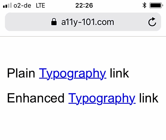
Underlined Links
People with dyslexia have problems reading and understanding text - despite their IQ. Roughly 10% of the world’s population have this dysfunction. Using simple language and avoiding capital letters helps people when reading your copy.
We've already covered the importance of proper declared links. The basic visual markup of a link is the underline. Underlining a link makes it stand out from the rest of the text. That's good. But there’s a problem with the underline. Every letter has a baseline. Think of it as the line the letter sits on. Some letters - like g, p, q, y, j - sit on that line and “let their feet dangle”. By underlining a word you put a line over these parts of the letters and it becomes difficult to read them.
Imagine you have problems with reading letters in general. Now think about how hard it would be for you to identify a letter that is partially struck through. To make a link more readable for people with dyslexia, we need a way to underline our word but without underlining every letter that goes below the baseline.
Our base styling:
a:hover { color: red; }
Solution 1
a.border {
    line-height: 1.2em;
    text-decoration: none;
    border-bottom: 1px solid blue;
}
a.border:hover {
    border-bottom-color: red;
}
Risks in this case: You have to maintain the colour of the border (normal and hover). Changing the colour of your font will lead to a change to this colour as well. The developer might forget to make that change. Besides that you have to find the right distance to your letter. You can end up with a border that "fell off the wagon" where the user doesn't get the connection between the link's copy and the border underneath it.
Solution 2
a.text-shadow {
    text-decoration: none; /* we don't want this native link style */
    border-bottom: 3px solid blue; /* because of this border */
    display: inline-block;
    line-height: 0.85; /* controls the position of the border */
    text-shadow: /* paints over border by applying 'glow' */
    2px 2px white,
    2px -2px white,
    -2px 2px white,
    -2px -2px white;
}
a.text-shadow:hover {
    border-color: red;
}
This seems like a smart idea. It basically does what we want. The underline gets interrupted as soon as it hits the “dangling part of the letters”. However, the risk is the same as with solution 1, i.e. you can't place your link on every background. When your CSS contains the text-shadow for yellow instead of white, you can't use the same CSS for a link on a white or dark background. The text-shadow has to match the background colour.
Solution 3
a.ink {
    -webkit-text-decoration-skip: ink;
    text-decoration-skip: ink;
}
Unfortunately this smart solution isn’t a standard, thus it isn’t universally well supported by browsers. Nevertheless, it does exactly what we want. Every so-called descender is skipped and not struck through. Again, this is not supported well. Only Safari and Chrome/Opera will understand this CSS declaration. In fact, Safari does this natively as a text-decoration-skip link. Wow!

A word of advice
And in the words of a person with dyslexia:
Speaking as a dyslexic, it definitely helps a lot to have descenders skipped. The underline becomes useful. However, if someone adds an underline and does not skip descenders, the line actually makes it very difficult to read and it actively hinders comprehension.
Browser support
Chrome since 61, Safari since 10.1 (needs -webkit prefix -- although links will get treated as if they have -webkit-text-decoration-skip applied [approx. since mid-2017]), iOS Safari since 9.3, Chrome for Android since 61. Let’s hope this very helpful method attracts more support from browser developers.
Make the best out of it
Until then you can use something like this to stay bulletproof:
<a href="/url" class="ink-alt">Typography</a>@supports not ((text-decoration-skip: ink) or (-webkit-text-decoration-skip: ink)) {
a.ink-alt {
text-decoration: none;
border-bottom: 3px solid blue;
padding-bottom: .2vh;
}
a.ink-alt:hover {
border-color: red;
}
}
a.ink-alt {
-webkit-text-decoration-skip: ink;
text-decoration-skip: ink;
}
a:hover {
color: red;
}