Tables
Okay, this one is kinda tricky. There used to be a time when we used tables for page layouting. That’s wrong. At some point (around 2004) we realised that tables are not for designing, but for displaying data.
That's not the tricky part. What is tricky is the fact that a sighted person gets the whole idea of a table by looking at it - no matter what the underlying markup looks like - yet it’s imperative to use proper, semantically correct markup for assistive technology. And the "fun part" is that nearly every kind of assistive technology I’ve used handles tables differently. Sigh.
To give you an idea of what the different techs will read out when served bad and good markup, I'll write it down, and then we'll have a look at a video so you get a better feel for the problem with tables.
The simple table
We'll start with a fairly simple table. Our simple table is a <table> with some rows (<tr>) and some cells (<td>) in them. Each table we're looking at will have three columns and five rows - including the first one with the header items.
So our first markup looks something like this:
<table>
    <tr>
        <td>1st row, 1st cell</td>
        <td>1st row, 2nd cell</td>
        <td>1st row, 3rd cell</td>
    </tr>
    <tr>
        <td>2nd row, 2nd cell</td>
        <td>2nd row, 1st cell</td>
        <td>2nd row, 3rd cell</td>
    </tr>
</table>
Chromevox
Chrome's Chromevox extension is more for people with bad eyesight. Chromevox reads out the content of each cell that we click on. It won’t recognise or read out any relationship between cells and rows. This simple table won’t be recognised as a table in the first place. Just as a load of cell content...
VoiceOver
As soon as I move over to macOS' VoiceOver I'll also turn on its rotor (Ctrl+Alt+u). By switching to the "Tables" window within the rotor we'll see that the rotor identifies our simple table as columns 3, rows 5
. That’s not really helpful.
Let's have a look at what VoiceOver reads out loud when navigating through the table with the arrow keys.
- Navigating with right arrow key on the x-axis
- Reads: "Product, column 1 of 2"
- Navigating with right arrow key on the x-axis, changing from one row to the next (first cell in new row)
- Reads: "Row 2 of 5, Peach, column 1 of 3"
- Navigating with down arrow key on the y-axis
- Reads: "Row 3 of 5, Cucumber"
Narrator
Window's Narrator won't recognise this table as a table. Using "Caps Lock"+Arrow-right Narrator first highlights the table, but doesn't announce it. Then it starts within the first cell.
- Navigating with right arrow key on the x-axis
- Reads: "Cucumber, non selected, column one, row three, cell"
Using the key combination "Caps Lock"+Arrow-right, Narrator will announce windows like we have them in VoiceOver's rotator. At some point we'll reach the "Tables". With three different types of tables on our test page, the simple table won’t be recognised. Narrator only finds two tables on our page. But for some reason I get to the first table after a fresh reload of the page. Don't ask me why.
NVDA
Interestingly enough, NVDA will recognise the simple table as a table. The screen reader announces a table with five rows and three columns, row one, column one
.
- Navigating with down arrow key on the x-axis
- Reads: "column one, Product"
- Navigating with down arrow key on the x-axis, changing from one row to the next (first cell in new row)
- Reads: "Row two, column one, Peach"
A slightly better table with th
This table is basically the same as the previous one, but with one small difference. In the first row we're not using
So our second markup looks something like this:
<table>
    <tr>
        <th>1st row, 1st cell</th>
        <th>1st row, 2nd cell</th>
        <th>1st row, 3rd cell</th>
    </tr>
    <tr>
        <td>2nd row, 2nd cell</td>
        <td>2nd row, 1st cell</td>
        <td>2nd row, 3rd cell</td>
    </tr>
</table>
Chromevox
Again, Chromevox will just read the content of the cell we click on. But the first time we click on any cell, the browser's extension will say table
. Just by adding header items with <th>, Chromevox will get the idea where the content comes from.
VoiceOver
VoiceOver's rotor will identify this table as columns 3, rows 5
, too.
- Navigating with right arrow key on the x-axis, first row
- Reads: "Product, column 1 of 3"
- Navigating with right arrow key on the x-axis, changing from one row to the next (first cell in new row)
- Reads: "Row 2 of 5, Product, Peach, column 1 of 2"
- Navigating further with right arrow key on the x-axis
- Reads: "Price, 1.99 €, column 2 of 3"
- Navigating with up/down arrow key on the y-axis
- Reads: "Row 3 of 5, 0.99 €"
Because of the <th> VoiceOver - or any assistive technology for that matter - will get the idea that there’s a relationship between the header item and the content from the same column.
Narrator
As soon as we hit the table Narrator will say table, columns Product, Price, Vegan, contains 5 rows
. Like Chromevox, Narrator now "sees" a table. What comes next is more sophisticated than what we saw in the previous table.
- Navigating with right arrow key on the x-axis, first cell in first row
- Reads: "table has 5 rows, 3 columns, Product, header-item, column header, row 1 of 5, column 1 of 3, non-selected"
- Navigating further on with right arrow key on the x-axis
- Reads: "Price, header-item, column header, column 2 of 3, non-selected"
- Navigating with right arrow key on the x-axis, changing from one row to the next (first cell in new row)
- Peach, non-selected, column header Product, row 2 of 5, column 1 of 3
- Navigating further with right arrow key on the x-axis
- Reads: "1.99 €, non-selected, column header Price, column 2 of 3"
I like how Narrator announces the value of a cell and then reads the corresponding column header. Finally it reads the "coordinates" such as the row and/or which column. That's the power of a little <th> ...
NVDA
NVDA is quite straightforward when it comes to reading this table. First, it will read table with 5 rows and 3 columns, row 1, column 1, Product
.
- Navigating with down arrow key on the x-axis, first cell in first row
- Reads: "column 1, Product"
- Navigating further on with down arrow key on the x-axis
- Reads: "column 2, Price"
- Navigating with down arrow key on the x-axis, changing from one row to the next (first cell in new row)
- row 2, Product, column 1, Peach
- Navigating further with down arrow key on the x-axis
- Reads: "Price, column 2, one € and ninety nine cents"
A semantically correct table
In our last example we throw everything at the <table> we have in our arsenal, i.e. <caption>, <thead> and <tbody> as well as <th> and scopes.
Our last table looks like this:
<table>
<caption>Things to eat</caption>
<thead>
<tr>
<th scope="col">Product</th>
<th scope="col">Price</th>
<th scope="col">Vegan</th>
</tr>
</thead>
<tbody>
<tr>
<th scope="row" class="th-inner">Peach</th>
<td>1.99 €</td>
<td>yes</td>
</tr>
<tr>
<th scope="row" class="th-inner">Cucumber</th>
<td>0.99 €</td>
<td>yes</td>
</tr>
<tr>
<th scope="row" class="th-inner">Cheeseburger</th>
<td>7.99 €</td>
<td>no</td>
</tr>
<tr>
<th scope="row" class="th-inner">Eggplant</th>
<td>1.35 €</td>
<td>yes</td>
</tr>
</tbody>
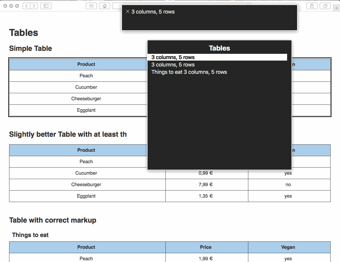
</table>First, let me explain a couple of things. The <caption> is some sort of headline for the <table>. You might think that's stupid. But let's have a look at VoiceOver's rotor. It will name this table Things to eat 3 columns, 5 rows
. Always imagine you can't see and rely on technology that reads things for you. Now add a few more tables to our page and the <caption> really is a great aid! Don't ban it from your page. If your designer gets pesky, just apply our .visible-hidden (see skip link) to the caption. That way it’ll be hidden from your designer, but not from assistive technology.
Why not use a proper headline like <h3>instead? Well, it wouldn't get "attached" to the table. You wouldn't find the <h3>in the "Tables" window, but in the "Headlines" window of VoiceOver's rotor.
Place your row with all the header items in the <thead> and all the data in <tbody>. You could use <tfoot> as well, but in our case we'll concentrate on the important stuff. What about the scope attributes within the <th>s of the <thead>? The browser receives the information it needs to determine that the <th> is the "master" of this column.
Interestingly enough we can even add <th> to the (in this case) first cell of a row. That way, this <th>, in combination with the scope="row", becomes the "master" or header item of this row.
I added a little bit of CSS so the <th> within the <tbody> doesn't get the same styling as the main header item (blue background, bold font).
Chromevox
Let's be honest - Chromevox is nice for when you have difficulties reading a page. But it can't compete with the "big guns". So what does Chromevox do with our awesome <table>? The same as with the <table> before. It just reads table
the first time we click on a cell and then it reads out the content of our cell. That's it.
VoiceOver
VoiceOver's rotor will identify this table as Things to eat, columns 3, rows 5
. That is also what VoiceOver will read when we navigate to the table.
- Navigating with right arrow key on the x-axis, first row
- Reads: "Product, column 1 of 3"
- Navigating with right arrow key on the x-axis, changing from one row to the next (first cell in new row)
- Reads: "Row 2 of 5, Product, Peach, column 1 of 3"
- Navigating further with right arrow key on the x-axis
- Reads: "Price, 1.99 €, column 2 of 3"
- Navigating with up/down arrow key on the y-axis
- Reads: "Row 3 of 5, Cucumber, 0.99 €"
Narrator
The first time we hit this table with Narrator it’ll say Things to eat. Table. Columns Product, Price, Vegan. Rows Peach, Cucumber, Cheeseburger, Eggplant
.
- Navigating with right arrow key on the x-axis, first row
- Reads: "row 1 of 5, Product, column 1 of 3, Product"
- Navigating further on the x-axis
- Reads: "header item, column header, column 2 of 3, Price"
- Navigating further with right arrow key on the x-axis and changing the row
- Reads: "header item, row column header Product, row 2 of 5, column 1 of 3, Peach"
- Navigating with up/down key on the y-axis
- Reads: "row 2 of 5, Peach, 1.99 €"
NVDA
With NVDA turned on, we'll hear this the first time we reach the table: table with 5 rows and 3 columns, Things to eat
.
- Navigating with down arrow key on the x-axis, first row
- Reads: "row 1, column 1, Product"
- Navigating further on the x-axis
- Reads: "column 2, Price"
- Navigating further with down arrow key on the x-axis and changing the row
- Reads: "row 2, Product, column 1, Peach"
- Navigating further with down key
- Reads: "Price, column 2, one € and ninety nine cents"
Semantics!
We're coming to the same conclusion over and over again. Know your semantics! Using proper, semantically correct HTML will do the job. I’d just like to say that with good markup you'll have covered 90% of all possible accessibility issues.
Responsive and accessible
Don't do it!
Believe me, I played around with this topic for quite a while. Once I had my markup sorted and after testing it with different assistive technologies, I wanted to make it responsive. There are some really nice solutions available on the internet to create beautiful responsive tables. I like the idea where the <th> is hidden with a data attribute displayed in front of the first cell of a row instead. But all of the technologies I've tinkered around with had one flaw: They mess up the natural behaviour of a table.
One might use display: flex; or even display: grid; on a <table>. Don't do it! It’ll break the semantics of the table. Don't believe me? Okay. In the following example we have the same markup as before. The good markup from table three. But this time I added this little piece of CSS:
table tr {
    display: grid;
    grid-template-columns: repeat(3, [col] 1fr );
    grid-gap: 0;
}
Visually it looks exactly the same. But as soon as we fire up VoiceOver's rotor and switch to the "Tables" window, we'll see that something went totally wrong.
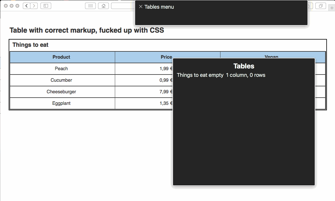
The display: grid; broke the table. Yes, rotor finds a table. But it only has one cell and zero rows. Thanks for that, dear smart-ass developer...
WAI-ARIA to the rescue?
You could argue that you can mess around with the semantics of a