Landmarks
Let’s go deeper. Now we’re getting to the good stuff. It’s so easy to use <div>s all over the place. But there are good people over at the W3C who came up with tools for you to use - so many wonderful HTML elements.
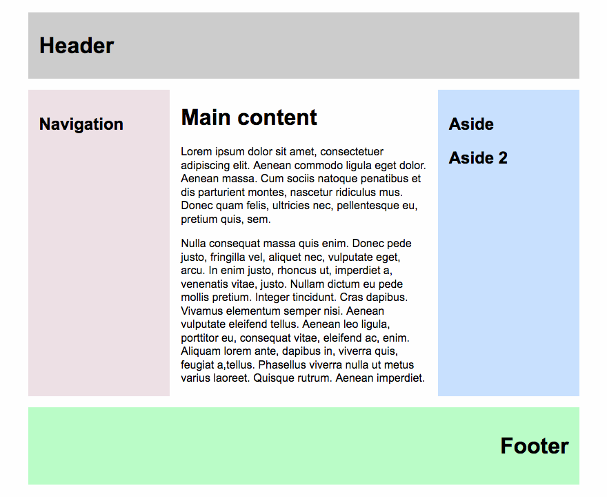
Most of the pages we create have a common structure: a header, a main navigation, one area where the content goes, maybe an area on the edge with additional information and a footer. Something like this:

The beauty of landmarks is that they help assistive technology a great deal. If possible, use proper HTML elements like <header> for the area at the top of your page. Most of the time it holds a hero image, a logo and maybe even the <nav>. The <nav> can stand on its own, too. Your whole content goes into the <main>. Don’t use something like <div id=”main”> because there’s an element you can use. Things like a list of last posts, advertisements or other “non-essential” stuff goes into the <aside>. You can have multiple <aside>. And of course we always finish off with the
Why use the correct markup? Well, first of all it’s correct. ;-) And then there are the screen readers. As with the headlines and the links, screen readers can collect the landmarks and tell the user what’s available on the page. That way the user can jump directly to the footer, for example.
Video example
This video shows our "classic page structure" example and how VoiceOver's rotator will identify each landmark. The user can jump directly to any landmarks, in this case we'll jump to the footer. (By the way: VoiceOver has some problems pronouncing my name ...)
Alternatives to landmarks
In a world where - for some crazy reason - you’re not able to use the correct markup and have to stick to your <div>s, you can add a little bit of WAI-ARIA magic in the form of role attributes.
To make your markup more accessible, you can do things like this:
| Bad | Good | Awesome |
|---|---|---|
<div id="main"> |
<div role="main"> |
<main> |
<div id="navigation"> |
<div role="navigation"> |
<nav> |
<div id="sideinfo"> |
<div role="contentinfo"> |
<aside> |
<div id="header"> |
<div role="banner"> |
<header> |
<div id="footer"> |
<div role="footer"> |
<footer> |
Don’t combine HTML5 elements with the role attribute. So don’t write <main role="main"> or, even worse, <main role="contentinfo">. The first example is redundant, while the second one is just plain wrong.