Structure
The guys and girls from the development department will bring your designs to life. Think carefully about the structure of your page. Bear in mind that sighted people will come to your page and scan it. They’ll simply fly over the headlines and decide what's of interest and then start reading an occasional passage on that page. That's how you and I will use a page.
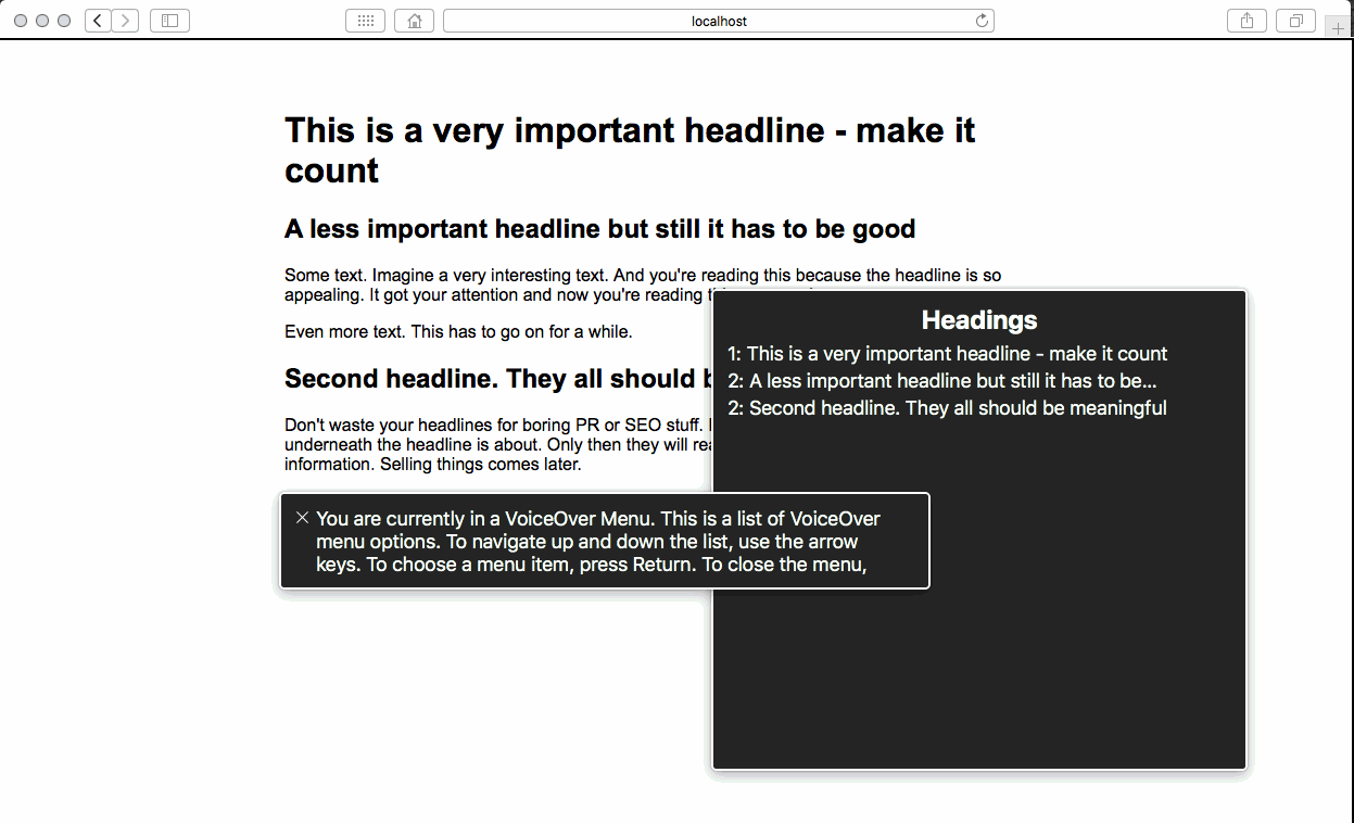
Now what about blind people? They need assistive technology like screen readers that read out loud what's on the page. But don’t forget that reading a whole page isn't scanning. Screen readers can scan by collecting all the headlines from the page and only reading those out loud. So make sure they’re good!
Always try to imagine what it would be like if you couldn’t see. Now this screen reader reads odd headlines, fancy SEO stuff, boring PR copy - do you think you’ll get a good idea of what’s behind these headlines or do they make no sense to you whatsoever? Remember that headlines are exactly how a non-sighted person will scan your page.
